This article contains affiliate links. For more, please read the T&Cs.
What is Exploratory Data Analysis (EDA)?
EDA with Python is a critical skill for all data analysts, scientists, and even data engineers. EDA, or Exploratory Data Analysis, is the act of analyzing a dataset to understand the main statistical characteristics with visual and statistical methods.
“The greatest value of a picture is when it forces us to notice what we never expected to see.”
John W. Tukey
John Tukey defined the main process for statisticians, and now data analysts, to explore data to enable the creation of hypotheses about a given dataset. The steps that should be taken have varied since Tukey came up with this process in 1961. However, many of the basics have not changed including the following:
- Loading and Understanding Data Definitions in Your Data
- Checking the Contents of the Data For Issues
- Assessing the Data Types
- Extracting Summary Statistics
- Generation of Data Visualizations:
- Boxplots
- Scatter Plots
- Creating Advanced Statistics
- Correlation Matrices
Where we stop currently in this post is jumping into advanced diagnostics for EDA for the purposes of checking regression analysis, classifier analysis, and clustering analysis – operations normally reserved for specific business problem solutions. Those topics we’ll cover in more detailed posts about those specific areas of analysis.
As for when and where EDA occurs in the traditional analytics and data science life-cycle, we can see in the below that EDA is one of the first and most critical steps before we proceed to any type of productionization of an algorithm. Within the CRISP-DM (Cross Industry Standard Process for Data Mining) we perform EDA in the Data Understanding phase of our initial analysis review.
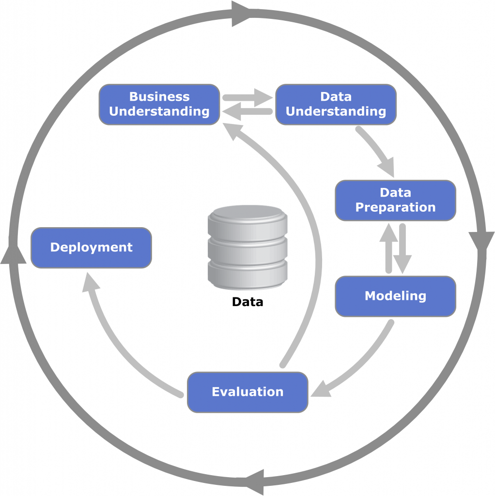
In this post, we’ll go over at a very high level some of the Business Understanding steps, but mainly we will focus on the second step of the CRISP-DM framework.
Python Libraries For EDA
Explain each library
Import code for each library
import numpy as np
import seaborn as sns
import matplotlib.pyplot as plt
import pandas as pd
%matplotlib inline
sns.set(color_codes=True)
Provide a reference to Pandas Ecosystem in What is Pandas
Load the Sample Data
We’ll be using an open-source dataset from FSU on Home sale statistics. It contains data on fifty home sales, with selling price, asking price, living space, rooms, bedrooms, bathrooms, age, acreage, taxes. There is also an initial header line, which we will modify in our data loading steps below:

file_name = "https://people.sc.fsu.edu/~jburkardt/data/csv/homes.csv"
df = pd.read_csv(file_name)
df.columns = ['Sell', 'List', 'Living', 'Rooms', 'Beds', 'Baths',
       'Age', 'Acres', 'Taxes']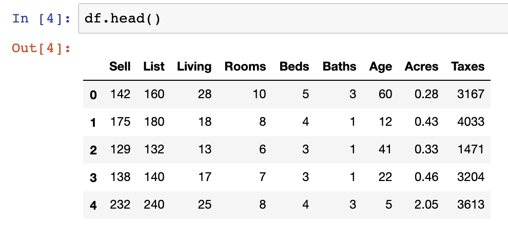
df.head()- Data column explanations/definitions
Check Column & Row Contents
- Reference to columns content post
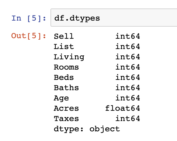
df.dtypes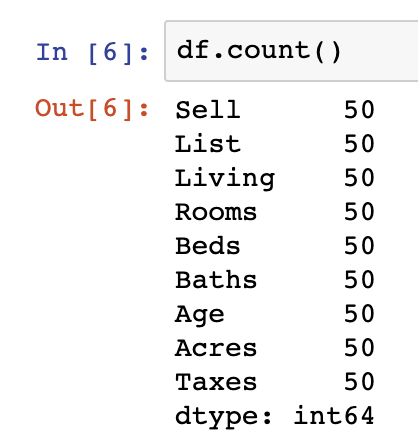
df.count()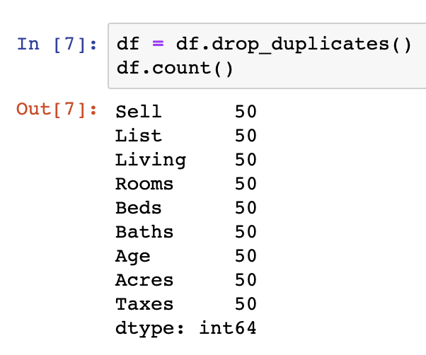
df = df.drop_duplicates()
df.count()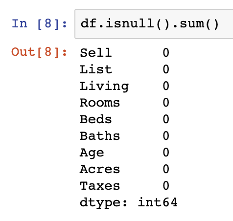
df.isnull().sum()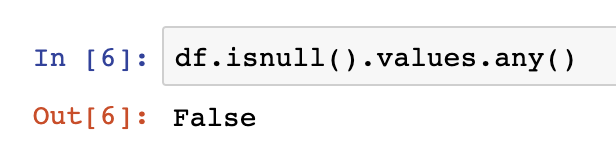
df.isnull().values.any()Column Data Type Assessment
One additional step we should be taking as a part of our evaluation of the data is to see whether the datatypes loaded in the original dataset match our descriptive understanding of the underlying data.
One example of this is that all data in our dataset is being read in as integer and float values. We should change at least two of the int64 variables into categorical datatypes – Beds & Rooms. This is done as those data points are of limited and fixed number of possible values.
df.dtypes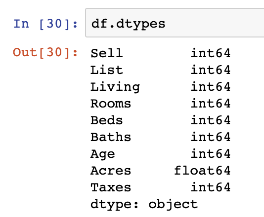
df['Beds'] = df['Beds'].astype('category')
df['Rooms'] = df['Rooms'].astype('category')
df.dtypes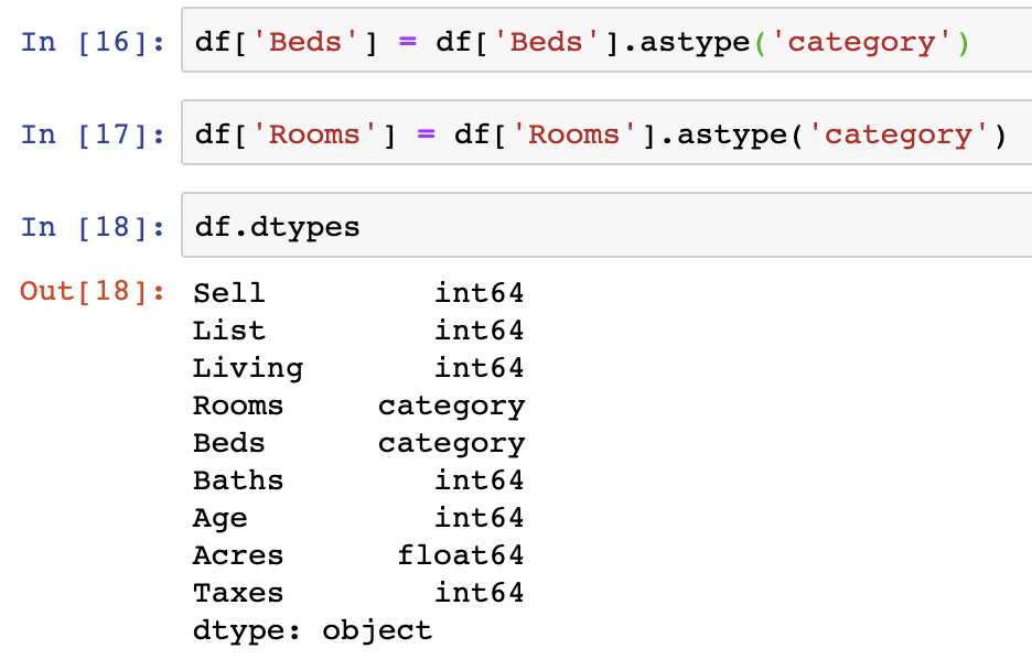
Summary Statistics
Summary statistics are there to give you an overall view of the metrics in your data set at a glance. They include the count of observations, the mean of observations, the standard deviation, min, 25% quartile, 50% quartile, 75% quartile, and the max value in each Series. What isn’t usually included in the outputs of summary statistics are categorical variables or string variables.
To get summary statistics in Pandas, you simply need to use DataFrame.describe() to get an output similar to the below:
df.describe()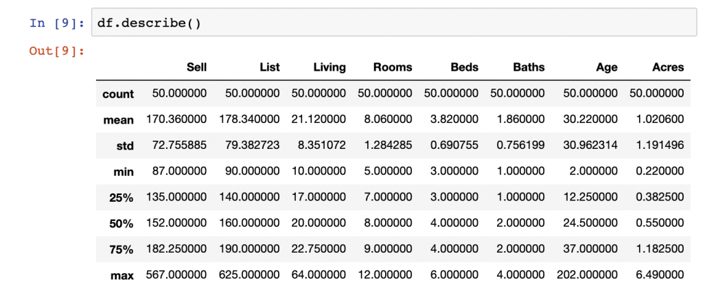
Boxplots
One important part beyond simply pulling summary statistical methods is to get a visual sense of the distributions of various variables within a given Series or Series by category using boxplots.
In the below example we generate a boxplot in the Pandas library. Here we look at List price from our dataset and split the data by the Beds variable.
df[['List','Beds']].boxplot(by='Beds')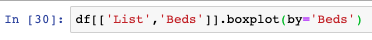
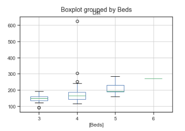
While Pandas does a good job displaying the data, we can also use the Seaborn libraries boxplot function to provide a slightly more visually appealing plot of the same data.
sns.boxplot(x='Beds', y='Sell', data=df,palette='rainbow')
Histogram & Jointplot Generation
Histograms, known as distribution plots in Seaborn, are another critical means of looking at our continuous variables in Python. Distribution plots are used to visualize univariate distributions of observations. Anyone who has taken a statistics 101 course would be familiar with them as a concept. They can be used to identify outliers, identify how normal a dataset is, and whether there are potential gaps in your dataset, along with other applications.
Below, we see a simple and elegant command for generating distribution plots using Seaborn on a Series within a DataFrame. In this case the List price of our dataset.
sns.distplot(df['List'])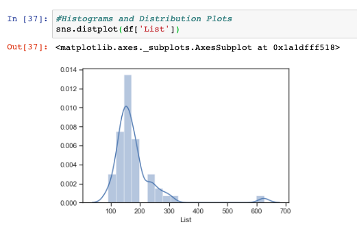
While histograms are useful to view, they are still ostensively univatiate in nature, meaning they only show the distribution of one variable at a time. When we want to compare two variables distributions at a time in Python, we can use the joint plot function.
In the below, we show the distributions on the top and right-hand side of the visualization of our List and Sell data points from our DataFrame. Additionally, we also see the observations in a hex plot, an optional plot design within Seaborn, to visualize in a cartesian plane to visualize how the two Series are related.
sns.jointplot(x='List',y='Sell',data=df,kind='hex')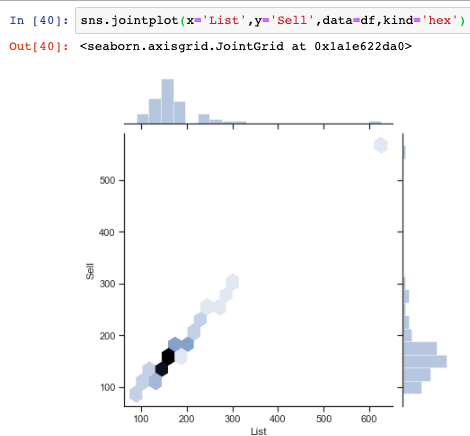
The quick and dirty approach to plotting histograms with just the Pandas library is seen below using the Series.hist() function
df['Sell'].hist()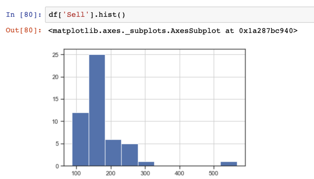
Scatter Plots & Pair Plots
Another common method of performing bivariate analysis, or comparing more than one variable, is to use scatter plots and pair plots.Scatter plots are useful to show individual values plot on a two dimensional cartesian X & Y plane from two Series in a Pandas DataFrame.
Here, we show a simple scatter plot visualized in Seaborn using Taxes as our value for the X-axis and Sell as our value for the Y-axis.
sns.scatterplot(x="Taxes", y="Sell",data=df)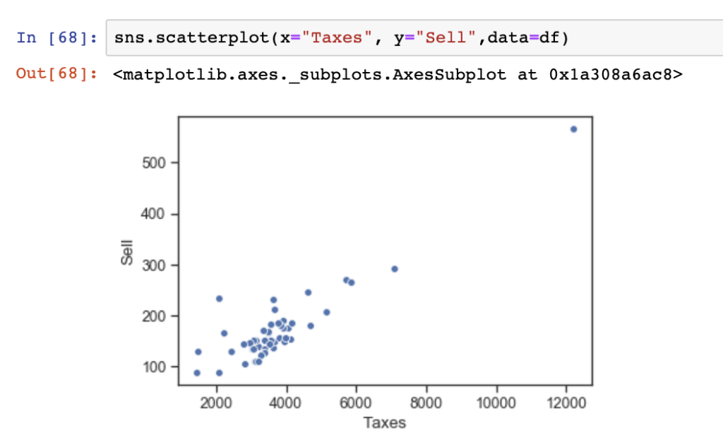
One additional and useful thing that can be done using Seaborn is to show a bivariate analysis in a scatter plot with an overlay of colored observations using categorical or other values. In the below, we show the relationship between Taxes and Acres in our dataset colored by the number of Baths in each observation (or house).
df.plot.scatter(x='Taxes',y='Acres',c='Baths',colormap='viridis')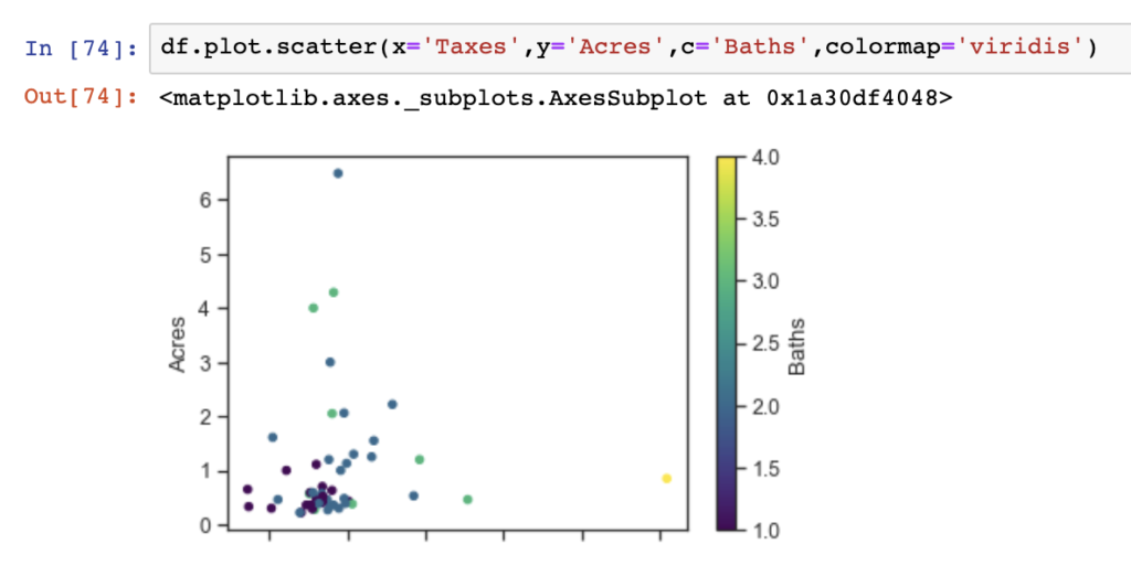
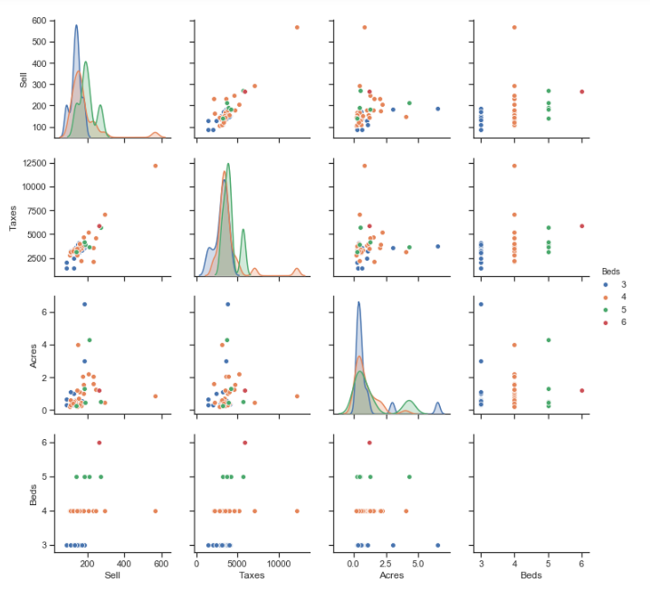
Pair plots can play a similar role to individual scatter plots as they provide a variety of visualizations. Pair plots provide bivariate analysis between each variable in a DataFrame, and similar to the scatter plots, can have observations colored by categorical variables. Additionally, the pair plots provides distributions of each individual variable diagonally down the pair plot display.
In the below, we show a pair plot using just the Sell, Taxes, Acres, and Beds variables from our DataFrame (to use all variables makes a much larger visualization which is hard to read).
sns.set(style="ticks")
sns.pairplot(df[["Sell","Taxes","Acres","Beds"]], hue="Beds")
Correlation Matrix
df.corr()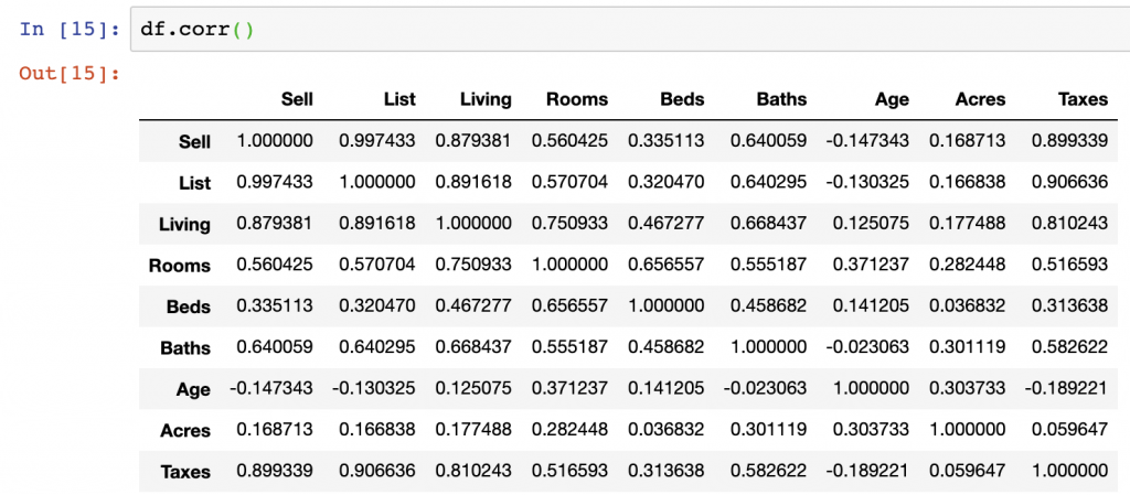
f, ax = plt.subplots(figsize=(10, 8))
corr = df.corr()
sns.heatmap(corr,
            xticklabels=corr.columns.values,
            yticklabels=corr.columns.values)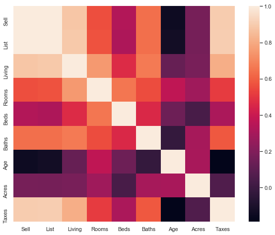
Data Analysis Summary
While we worked through the examples of EDA in this dataset, we can come away from our view of this data with a few findings.
- Taxes and the Sell price appear highly, positively, correlated – this is shown in the pair plot and correlation matrix outputs
- Acres compared with Taxes and Sell price do not have strong correlations – we can see this in the correlation matrix outputs
- Age and Taxes, Sell, and List prices all appear to be negatively correlated – we can see this in the correlation matrix outputs
- List and Sell prices are positively correlated in the positive direction – The directionality of correlation is important to understand, and we see this in our scatter plots and correlation matrix
While there are many other items we could discuss in this dataset, the above are just a few of the items we can walk away from this EDA process having learned.
Summary
While performing EDA with Python can seem challenging at first, it is a rather straight forward process as we have shown here.
There is a massive amount of information on EDA that you can find outside of this post, however, we’ve done a near-complete job summarizing all the statistics you may want to examine prior to beginning any advanced analytics on top of your dataset.
Below are some of the best articles, academic libraries, and GitHub repositories on the web showing how EDA with Python can be performed with other example datasets:
- Books: Think Stats, Exploratory Data Analysis
- Exploratory Data Analysis (EDA) and Data Visualization with Python – https://kite.com/blog/python/data-analysis-visualization-python/
- Hitchhiker’s Guide to Exploratory Data Analysis – https://towardsdatascience.com/hitchhikers-guide-to-exploratory-data-analysis-6e8d896d3f7e
- Exploratory data analysis in Python –https://towardsdatascience.com/exploratory-data-analysis-in-python-c9a77dfa39ce
- HarvardX’s Exploratory Data Analysis for Biometic Data Science – https://genomicsclass.github.io/book/pages/exploratory_data_analysis.html
- Supervised Regression Workflow from EDA to API – https://towardsdatascience.com/supervised-machine-learning-workflow-from-eda-to-api-f6a7719ad897
- A Kaggle notebook – https://www.kaggle.com/ekami66/detailed-exploratory-data-analysis-with-python
- Data Science Life cycle and Exploratory Data Analysis with Python – https://medium.com/@swastiknayak76/data-science-life-cycle-and-exploratory-data-analysis-with-python-f8005febe131
- “Chapter 8: Plotting & Visualization” in Python for Data Analysis
We hope you enjoyed this article. For the code used in this article see our GitHub Repo here.