A pandas boxplot, often known as box and whisker plot, is a type of data visualization that is relatively straightforward. Its simplicity is a plus, according to me.
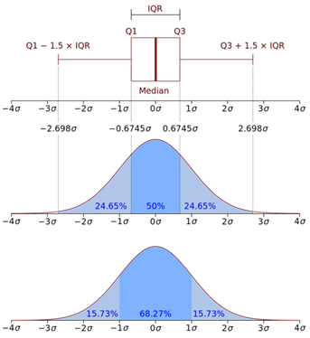
A boxplot can quickly display a large number of summary statistics. Boxplots display the median, minimum, maximum and quartiles of a distribution on a single graph, and can also include outliers as well. A quartile divides data in ways — lower quartile, median, and upper quartile — to form four groups in the dataset.
How Is Such Large Amounts Of Data Displayed In Each Visualization?
A box is drawn with the 25% quartile value for the bottom edge/left (depending on the orientation of the box) and the 75% quartile value for the other edge. The distance between the 25th and 75th percentile edges indicate dispersion.
The median value is represented by a line. This median line’s position might also indicate skewness. If the median is located halfway between the 25 and 75 % quartile edges, the population is probably normally distributed. Whiskers are drawn from the box’s edges and terminate at the minimum and maximum values.
Outliers have been drawn as hashes on the plot outside of the whiskers.
With normal distributions of data, this displays a lot of information in a short period of time. This enables rapid exploratory data analysis and the advancement of work. Furthermore, the plot is simple and requires little explanation.
Let’s understand the different metrics displayed by a pandas boxplot:
- median (50th Percentile): middle value of the dataset
- 1st quartile (Q1): the middle number between the smallest number (not “minimum”) and the median
- third quartile (Q3): the middle value between the median and the highest value (not “maximum”)
- interquartile range (IQR): 25th to the 75th percentile.
- Maximum value: Q3 + 1.5*IQR
- Minimum value : Q1 -1.5*IQR
Let’s Now Look At How The Pandas Boxplot Is Created
import numpy as np,pandas as pd
import matplotlib.pyplot as plt
import seaborn as sns
%matplotlib inline
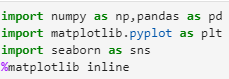
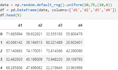
data = np.random.default_rng().uniform(20,75,(10,4))
df = pd.DataFrame(data, columns=[‘d1′,’d2′,’d3′,’d4’])
df.head(5)
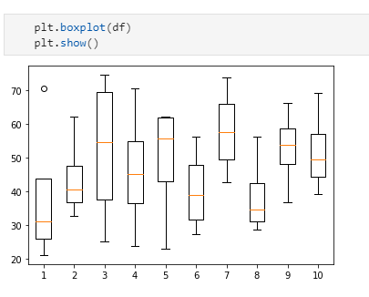
plt.boxplot(df)
plt.show()
Let’s now address some common boxplot questions:
- How do I plot a boxplot from various data sources in a DataFrame?
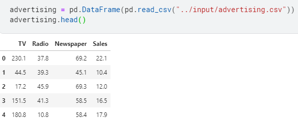
Let’s use dataset from Kaggle to plot a boxplot.
# Import the numpy and pandas package
import numpy as np
import pandas as pd
# Data visualisation
import matplotlib.pyplot as plt
import seaborn as sns
Let’s load the dataset :
advertising = pd.DataFrame(pd.read_csv(“../input/advertising.csv”))
advertising.head()
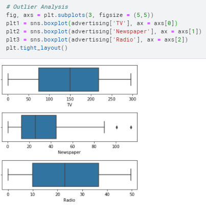
fig, axs = plt.subplots(3, figsize = (5,5))
plt1 = sns.boxplot(advertising[‘TV’], ax = axs[0])
plt2 = sns.boxplot(advertising[‘Newspaper’], ax = axs[1])
plt3 = sns.boxplot(advertising[‘Radio’], ax = axs[2])
plt.tight_layout()
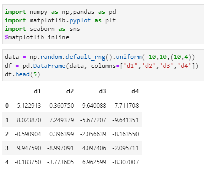
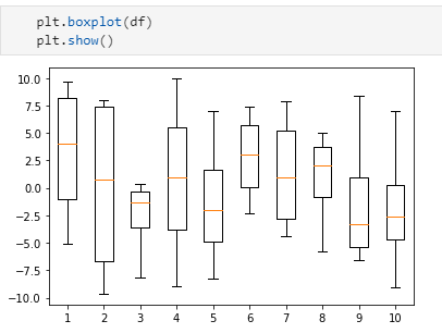
- Can I create a boxplot with positive and negative numbers?
Yes, you can create a boxplot with negative and positive numbers.
Let’s demonstrate it:
import numpy as np,pandas as pd
import matplotlib.pyplot as plt
import seaborn as sns
%matplotlib inline
data = np.random.default_rng().uniform(-10,10,(10,4))
df = pd.DataFrame(data, columns=[‘d1′,’d2′,’d3′,’d4’])
df.head(5)
plt.boxplot(df)
plt.show()
Summary
I hope this article has taught you on how to plot a boxplot, and how to interpret it as well. Panda boxplots come very handy when you have to check data distribution, median (plus other numerical computations) and outliers.
References
- Official documentation for boxplot
- Official documentation for matplotlib
- Official documentation for seaborn
- Image credits – WikiMedia
- Jupyter Book Online