This article contains affiliate links. For more, please read the T&Cs.
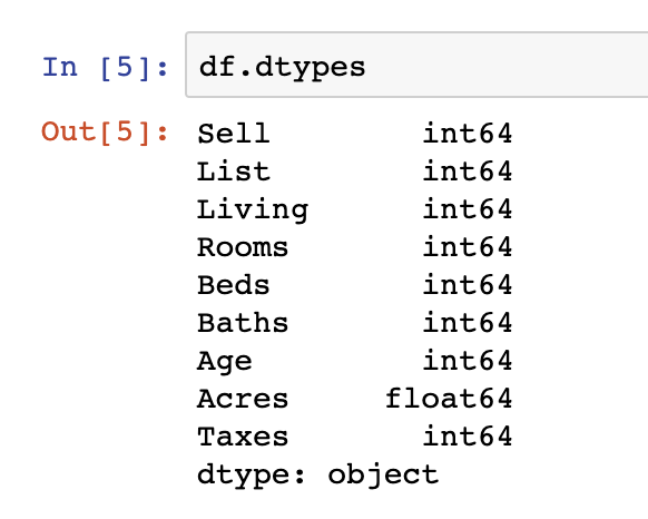
Classification
One of the two major types of predictive modeling in supervised machine learning is classification. The other being regression, which was discussed in an earlier article. Classification involves predicting the specific class (of the target variable) of a particular sample from a population, where the target variables are discrete categorical values and not continuous real numbers. A couple of examples of classification problems include:
- Disease Detection: Classifying blood test results to predict whether a patient has diabetes or not (2 target variable classes). This is an example of binary classification
- Image Classification: Handwriting recognition of letters (26 classes) and numbers (9 numbers). This is an example of multi-class classification
Model Evaluation
A Classification model’s performance can only be as good as the metric used to evaluate it. If an incorrect evaluation metric is used to select and tune the classification model parameters, be it logistic regression or random forest, the model’s real-world application will completely be in vain.
One of the critical aspects when considering a classification model’s evaluation metric is that a simple accuracy metric (i.e. calculating whether each classification prediction was correct or incorrect) is not generally an appropriate metric, especially when the training dataset is imbalanced. An Imbalanced dataset refers to one where the number of samples in the training dataset for each class label is not balanced and the class distribution is not equal or close to equal. This could be because of two potential reasons – one, the real world training data and occurrence of each class itself is imbalanced; or second, that the training data is inherently biased or skewed.
For example, if a classification model is intended to predict fraudulent transactions from a dataset where 90% of the samples are not fraud and 10% are fraud, then a naive classifier, regardless of input, will be 90% accurate on average. That means, in a dataset out of 100 samples where 10 are actually fraudulent, if the model were to predict that all 100 were not fraudulent, then the accuracy metric will yield a 90% accuracy of the model, which is misleading to say the least about the model’s performance.
However, there are a myriad of ways of evaluating classification model performance, other than just accuracy, each having their own use cases and strengths and weaknesses. Each evaluation metric makes some assumptions about the problem or about what it is that is important in the context of the problem. Therefore, an evaluation metric must be chosen that best captures the intent of the problem and what it is that is being classified, which makes choosing model evaluation metrics a challenging undertaking.
Most machine learning engineers and data scientists who use Python, use the Scikit-learn library, which contains built-in functions for model performance evaluation. In this article, we will walk through 7 of the most widely used metrics, implement them and explore their uses cases with their advantages and disadvantages, as listed below.
- Accuracy Score
- Recall/Sensitivity
- Precision
- F-Score
- Classification Report
- Receiver Operating Characteristic (ROC) Curve
- Area Under ROC Curve
The Building Blocks
Before we delve into the details of each of the metrics, it is important to cover the four building blocks used to define the evaluation metrics:
- True Positive (TP) – Actual label is positive and prediction is also positive
- True Negative (TN) – Actual label is negative and prediction is also negative
- False Positive (FP) – Actual label is negative but prediction is positive
- False Negative (FN) – Actual label is positive but prediction is negative

Remember, the definition of “True”, “False” depends on the objective of the problem. If the classifier model’s objective is to detect patients that have diabetes, then “True” refers to samples, patients, who have diabetes.
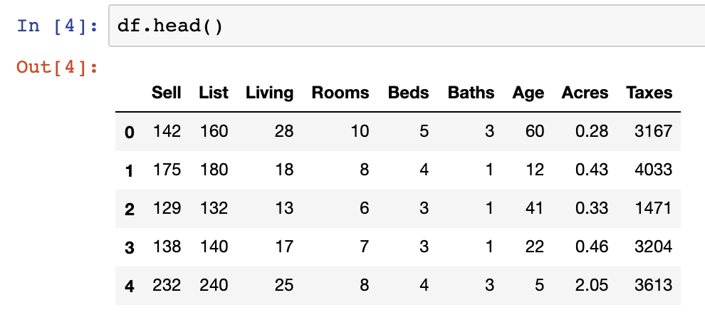
Dataset Extraction and Model Implementation
For our walkthroughs, we will be using the diabetes dataset from Kaggle, which is a binary classification dataset. The dataset is first extracted below using Pandas.
import pandas as pd
diabetes_df=pd.read_csv('diabetes.csv')
diabetes_df.head()
Next, let’s explore the balance of the target variable ‘Outcome’, to see how balanced the dataset is.
diabetes_df.Outcome.value_counts()| Outcome | Frequency |
| 0 | 500 |
| 1 | 268 |
As we can see above, the target variable is heavily skewed towards the Outcome value of ‘O’.
Next, we implement the classification model on the dataset using a basic k-Nearest Neighbour (kNN) classifier and an 80-20 train test split. As you can see below, most of the libraries used below for splitting the dataset as well as model implementation are used from the Scikit-Learn library. To be consistent with the scope of this article, we will not delve too in-depth with the selection of the classification model, but feel free to explore other classification models such as SVC, Random Forest, Logistic Regression, GBM, etc.
x = diabetes_df.drop('Outcome',axis=1).values
y = diabetes_df['Outcome'].values
from sklearn.model_selection import train_test_split
x_train, x_test, y_train, y_test = train_test_split(x, y, test_size=0.2, random_state=1, stratify=y)
from sklearn.neighbors import KNeighborsClassifier
#Create kNN (k Nearest Neighbor) classifier, with k value of 15
knn = KNeighborsClassifier(n_neighbors = 15)
#Fit the classifier to the data
knn.fit(x_train,y_train)
y_pred = knn.predict(x_test)
We print out the first 15 samples with their actual target variable and the predicted target variable by the k-NN classifier just to gauge the classifier’s ability.
pd.DataFrame(data={'Predicted': y_pred, 'Actual': y_test}).head(15)| Predicted | Actual | |
| 0 | 0 | 0 |
| 1 | 0 | 0 |
| 2 | 0 | 0 |
| 3 | 1 | 1 |
| 4 | 0 | 0 |
| 5 | 0 | 0 |
| 6 | 0 | 0 |
| 7 | 0 | 0 |
| 8 | 1 | 0 |
| 9 | 0 | 0 |
| 10 | 0 | 0 |
| 11 | 0 | 0 |
| 12 | 0 | 1 |
| 13 | 0 | 0 |
| 14 | 0 | 0 |
We do a similar treatment on the Iris flower dataset, in terms of dataset extraction and classifier implementation. The Iris flower dataset is a multiclass dataset, which will be used to predict the flower type based on flower petal dimensions.
Next, we dive straight into the evaluation metrics.
1. Accuracy Score
Accuracy is the most basic version of evaluation metrics. It is calculated as the ratio of correct predictions (TP + TN) over all the predictions made (TP + TN + FP + FN).

The accuracy score can be obtained from Scikit-learn, which takes as inputs the actual labels and predicted labels
from sklearn.metrics import accuracy_score
print ('accuracy =',metrics.accuracy_score(y_test, y_pred))
Accuracy = 0.74026
Accuracy is also one of the more misused of all evaluation metrics. The only proper use case of the accuracy score is a dataset that is almost perfectly balanced, which is rarely applicable for any real world dataset. The reason for this is that a high accuracy metric is attainable by any no skill/naive classifier model that only predicts the majority class. Additionally, the accuracy metric does not allow Data Scientists to prioritize the importance of True Positives or True Negatives, which we will see later is dependant on the objective of the classifier model.
2. Recall/Sensitivity
Recall, often referred to as Sensitivity or True Positive Rate (TPR), is the fraction/ratio of samples that the classifier model predicted to be the positive class to the samples that actually belongs to the positive class. It basically summarizes how well the positive class was predicted by the classifier.

from sklearn.metrics import recall_score
recall_score(y_test, y_pred)
Recall = 0.44444
As you can see, the score is significantly less for recall than it was for accuracy.
Recall is the go-to metric when there is a high cost associated with a False Negative. For example, a potential use case for this is in sick patient detection, perfect for our diabetes dataset. If a sick patient (actual Positive) goes through the classifier model and is predicted as not sick (predicted Negative), that is definitely less desirable than its reverse case. The cost
associated with a False Negative will be extremely high if the sickness goes undetected by the classifier and also happens to be contagious. Therefore, for such a model as in our diabetes case, when you do hyperparameter tuning for the classifier model, you would want to tune it to maximize the recall evaluation metric, since as aforementioned the model performs quite poorly in terms of meeting its objective when you look at recall.
3. Precision
Precision, often referred to as Positive Predicted Value (PPV), is the fraction of samples that the classifier model predicted to be the positive class to the total of number samples that were predicted to be in the positive class. It summarizes how precise the model is out of those predicted as positive; how many of them actually are positive.

from sklearn.metrics import precision_score
precision_score(y_test, y_pred)
Precision = 0.70588
Compared to the recall score, this classifier model performs much better on the precision evaluation metric, very close to the accuracy score.
Precision is a good metric to use when the cost of False Positive is high. In this case, for instance, a potential use case for precision as the evaluation metric is in spam vs ham email classifier. In email spam detection, a false
positive means that an email that is actually non-spam (actual negative) has been classified as spam (predicted as spam). As a result, the user might lose important emails to the junk/spam folder if the precision is optimized for a spam detection model. Therefore, it appears that our k-NN classifier is actually optimized for a spam detection classifier, given that it has a higher precision score than recall.
4. F-Score
F-Score, often referred to as F-Measure, is a harmonic mean of precision and recall.
from sklearn.metrics import f1_score
f1_score(y_test, y_pred)
F-Score = 0.545454
As a result of being the harmonic mean of precision and recall, the F-Score nestles in between the two in terms of the score.
In a lot of applications, there is some desired balance between precision and recall. Those would be the use cases for F-score. For example, a classifier that has no downstream (negative) impact associated with False Negative versus False Positive, such as a basic image classifier.
5. Classification Report
Scikit-Learn also provides a very convenient summary of precision, recall, and F-score through its classification report.
from sklearn.metrics import classification_report
print(classification_report(y_test, y_pred))
6. ROC Curve
A receiver operating characteristic (ROC) curve, is a diagnostic plot that visualizes the behavior of a binary classifier model by calculating the false positive rate and true positive rate by changing the model’s classification/discrimination thresholds. It is essentially a plot of signal (True Positive Rate) versus noise (False Positive Rate)
Going back to the basics, the threshold value is used to define which prediction probability is set to label a given test sample as predicted positive or predicted negative during the classification step. For most models, the default threshold value is 0.5.
import scikitplot as skplt
y_probas=knn.predict_proba(x_test)
skplt.metrics.plot_roc(y_test, y_probas, figsize=(10, 8))
Note that for a multiclass classification problem, the individual ROC curves for each class will be a One vs Rest plot.
For reference, below is an illustration comparing a good and bad ROC curve.

A classifier that does a very good job of distinguishing between the classes will have a ROC curve that hugs the top left corner. The perfect diagonal line is a no skilled model that does no better than a random guessing model. It is often a good idea to plot ROC curves for different threshold values of the classification models and see which performs the best.
However, as you can see the plot if of a visualization technique and does not output a quantitative score as the evaluation metric. That is where the next metric comes in.
7. ROC Area Under Curve (AUC)
As the name suggests, the ROC AUC calculates the area under the ROC curve and provides a single score as an evaluation metric. As seen in the visualization, the larger the area under the curve, the more skilled the classifier and vice versa i.e. and ROC AUC of 1 is considered a perfect skill classifier.
from sklearn.metrics import roc_auc_score
probs = y_probas[:, 1]
print ('ROC AUC =', roc_auc_score(y_test, probs))
ROC-AUC = 0.7865
Final Thoughts
The above are just a few of the more common evaluation metrics used in Classification Models. There are few others used out there as well such as Precision-Recall Curve. Feel free to explore them and research their use cases. As we have seen above, the evaluation metric (or a combination thereof) that should be used for a given classification model, totally depends on the model’s objectives and the business problem context at hand. You must narrow down your evaluation metric first before you move onto the next stage of hyperparameter tuning for that model’s parameters.
In case you want to access the ipnyb code file, you can find them here. Additionally, more examples of model evaluation can be found in the book Chapter 5 of Introduction to Machine Learning with Python.