All datasets have one obvious thing in common, information, but this information is easy and fast to extract? Normally, no. As a result, why not use battle-scarred Statistics techniques to help us extract those precious insights from data?
In other words, using techniques such as Correlations, Histograms, Quantile Statistics, and Descriptive Statistics can help us. Happily, Pandas-Profiling comes to the rescue by giving all those Statistics for free. In addition, the developers of the Pandas-Profiling library really put the effort to give a full report. The report also contains the type of columns, missing values, unique values, text analysis, and most frequent values.
On the other hand, the reader may think, “I can achieve this by using Pandas and a visualization library!” Yes, you can, but why not save the precious programming time of a Data Scientist to extract insights from data. However, we have to remember that it’s essential to understand the meaning of Statistics and how the library generates its results.
Dataset Statistics reports with Pandas-Profiling:
Pandas-Profiling gives you the capability to save your Report to different formats such as HTML or a “Jupyter-notebook iframe”. The HTML file feature is useful because an end-user without programming knowledge can open the HTML file. And, an experimental feature “to_app()” is available, which lets the user converts a Profile Report to a PyQt5 user interface.
In short, we will make use of the agility provided by Pandas-Profiling and explore his generated exploratory analysis. So, at each dataset exploration, you can make use of different and useful Pandas-Profiling features, such as “to_file()” and “to_notebook_iframe()”. Also, with a change of parameter, the lib can deal with large datasets (argument minimal set to True).
Last but not least, let’s get some data to play with from the Kaggle Datasets database. We’re going to use the grad acceptance dataset, it’s available on the following link: Grad Acceptance – Kaggle. Also, many thanks to Mohan S Acharya, Asfia Armaan, and Aneeta S Antony for open-sourcing the data. But, if the data is no longer available on Kaggle, you can download it from here on my Github.
Our example Dataset contains students’ performance in different sections of knowledge such as the TOEFL score and the CGPA score. Our data also contains the acceptance probability in a Grad program ranging from zero to one. Certainly, the profile Report will help us explore the correlation in student scores and the acceptance probability. In addition to this, four correlations matrices will be available.
Therefore, let’s use the help of Pandas-Profiling to get information about the data preparation necessary. As a result, we can safely pipe this dataset to a Machine Learning model.
Unlocking the Statistics power of Pandas profiling with two lines of code:
Install the Pandas-Profiling library by running the following command in your command-line:
If you use “pip”:
pip install pandas-profiling[notebook,html]
If you use “conda”:
conda install -c conda-forge pandas-profiling
In this step, see how to load a DataFrame as a Statistics Profile Report:
[gist https://gist.github.com/gtfuhr/43c83730353229ef1beea9846fdd5af1 /]
Generating the Profile Report
In general, passing the DataFrame, the desired title, and the HTML formatting for the “ProfileReport” class generate the Report. Due to this, you can perform your analysis on the Report, without having to perform repetitive computations to generate descriptive analytics. That’s free time to focus on the problem’s tougher parts.
[gist https://gist.github.com/gtfuhr/9a0b69da697372222cdba17d8f81080c /]
Meanwhile, sit down and relax, Pandas-Profiling it’s doing its magic! It took only eleven seconds to generate the report and save it to HTML and JSON. You only need to decide if you will display the report or save it to a file. To demonstrate, we will create a “notebook_iframe” by calling the to_notebook_iframe() method of the ProfileReport class. But, don’t worry, we’ll check the other formats and see their differences.
[gist https://gist.github.com/gtfuhr/185969892ba8b5111624e0fe54889884 /]
While the notebook_iframe format presents more details when compared with the other display method to_widgets(). But, the “iframe” becomes slower as the dataset size starts to increase. To solve it, save the report to HTML to leverage detail and performance.
Sections of a Profile Report
Now let us dive into the different sections of the Profile Report:
Remind, why this is important? Reading this report will make you detect the data quirks and see the necessary steps of data cleaning and preparation. For example, the final form of the dataSet will not have duplicate data, preventing possible overfitting on the training section. Now you can catch missing values, duplicate data or wrong data types or any other data problem. The ProfileReport will help you in the mission of checking all the boxes of the data cleaning/preparing checklist.
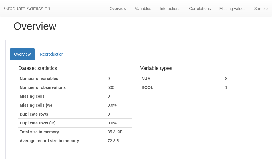
Main tab of the Report, the Overview:
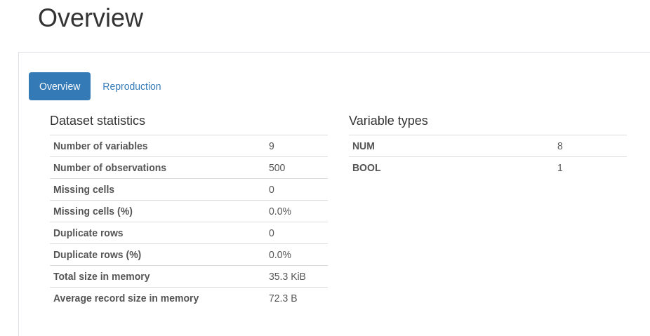
Overview
The overview section will display a tab with the number of variables (features), the DataFrame length, missing values, duplicate data and a list containing the variables data types.
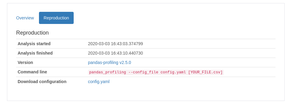
Reproduction
This section will give information about how the Profile Report creation, the Pandas-Profiling library version, the time of creation, and a configuration file that looks like this: config.yaml.
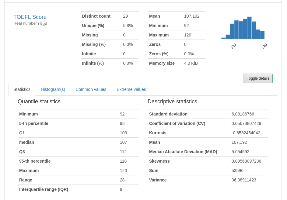
Variables
The first variable (feature) here
In this section, each variable gets its light spot. For example, data such as the uniqueness of a feature, values missing, mean, min, max, and the number of zeros. But wait, there is more! Click at the “toggle details” button and you can see all of the Quantile and Descriptive Statistics. The new tab displays a Histogram and the most common and the most extreme values (Useful to detect outliers).
Others variables (features)
You can explore the information described above by looking at each variable card in the Variables section.
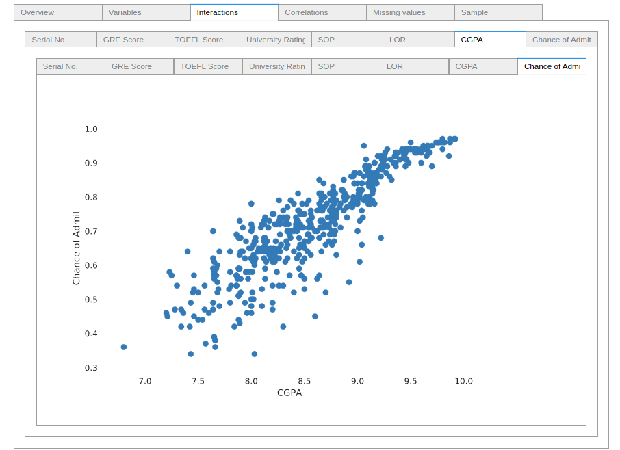
Interactions
Interaction scatter-plots between Variables
Each pair of features gets a scatter-plot representation of their interaction. Those plots are very helpful to identify some trends and important correlations in the data. For example, look at how the CGPA feature interacts with the acceptance probability.
Hint: this feature works better with the to_widgets() method call than with a generated notebook_iframe.
Correlations
Pandas-Profiling provides us four different correlation coefficients matrices. Such as Pearson’s r, Spearman’s ρ, Kendall’s τ and the novel Phik Φk (A paper by M. Baak et al can provide deeper insights about Phik Φk.).
Pearson’s r
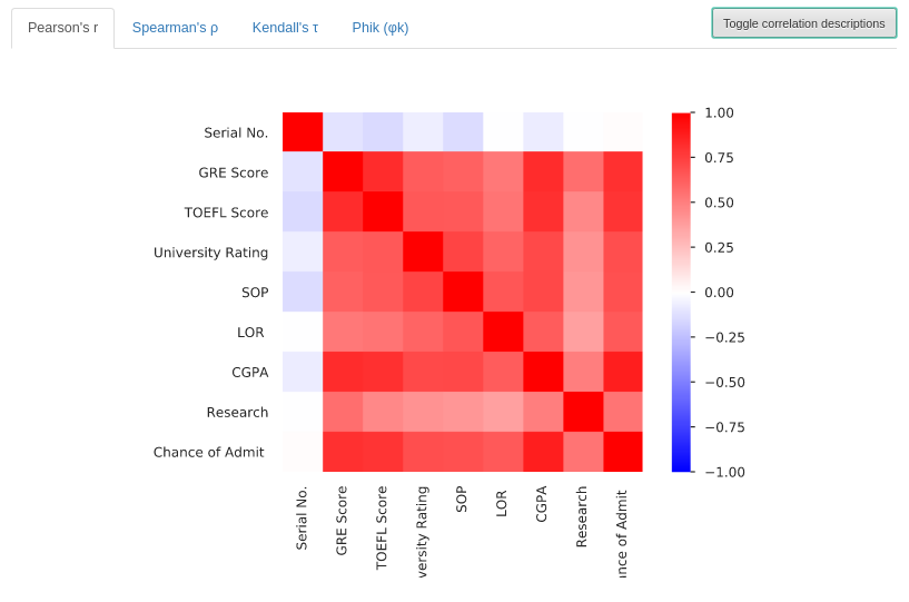
This section presents a correlation matrix of Pearson’s r. It shows the linear correlation between variables, the values can range from -1 to +1 (Blue to Red).
Spearman’s ρ
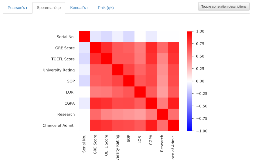
Now the Profile shows a correlation matrix of Spearman’s ρ. This matrix is showing the monotonic correlation between features, the values range from -1 to +1 (Blue to Red). A monotonic correlation represents how much the fact of a variable increasing, makes another variable increase its value. The same is valid for two variables decreasing together.
Kendall’s τ
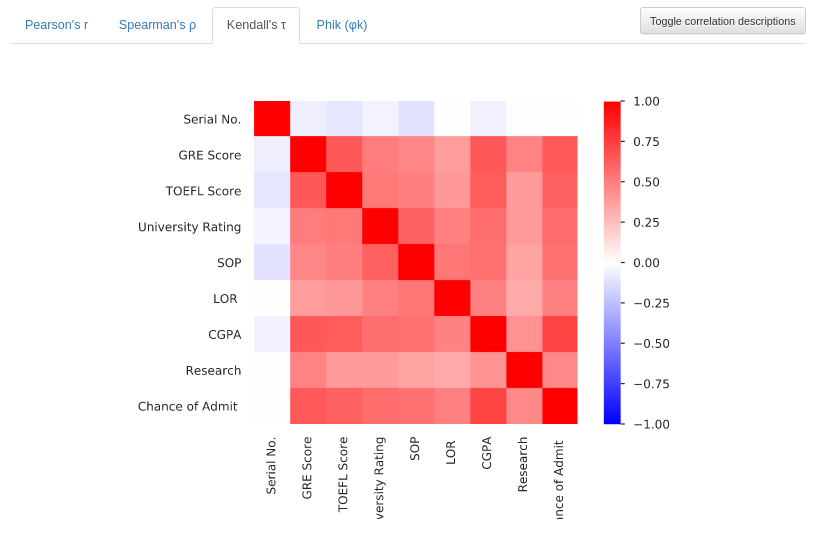
This matrix plot shows Kendall’s τ ordinal correlation between variables. Showing the degree of correlation of features of data sorted in an ordinal way. The values also range from -1 to +1 (Blue to Red). Additionally, you can learn more about Kendall’s tau in this Youtube video.
Phik Φk
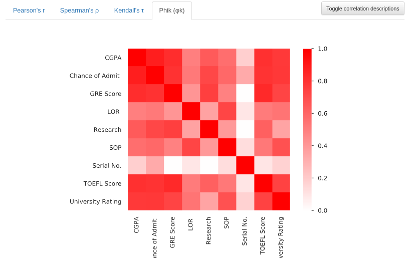
Since this version of Pandas-Profiling (V2.5) does not explain the Phik coefficient. As seen in the article from M. Baak et al, the Φk can detect even non-linear correlations and works with categorical and ordinal variables. Unlike the others, this correlation has values that range from 0 to 1 (White to Red).
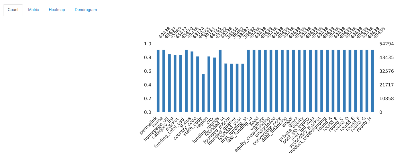
Missing Values
Missing values, where are they?
Each variable may have its missing values, and this tab provides information about how much of them is missing. The user can choose to see the missing values as a Matrix, Heatmap and also as an Endogram.
For this print, a different dataset with missing values was used:
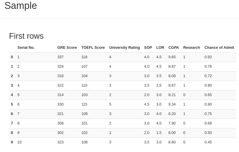
Sample
After getting to know the data quirks, let’s look at it!
Do you remember the methods DataFrame.head() and DataFrame.tail()? They show, respectively, the first and the last 5 rows of data. Just as those methods, this final section shows the “head and tail” output, displaying a bit of the data.
That was a complete analysis of the data structure. Thanks to Pandas-Profiling, it’s for free!
In conclusion, you know how Pandas-Profiling works. Therefore, if you want to, you can generate a report with an interesting game dataset of our other post. This experience can make your data exploring faster, with the bonus of providing your colleagues and clients useful Reports. That’s all folks, thanks for reading and have a Pythonic day!
Want to check the documentation of Pandas-Profiling and the functions used in this tutorial? If so, they’re available below:
The code utilized in this post is available here on Github.
If you like Data Science, don’t forget to check our other posts at Data Courses.